Reportcards
Reportcards website and coaching centre tools
A learning centre's website and connected tools: accounts, practice tests, grading, a coaching centre ERP and English enrichment.
Three builds, one centre
Pick a part of Reportcards
Reportcards is not one project. It is a public website, the ERP the centre runs on, and a set of English tools for students. Each was designed for a different person, so each has its own page.
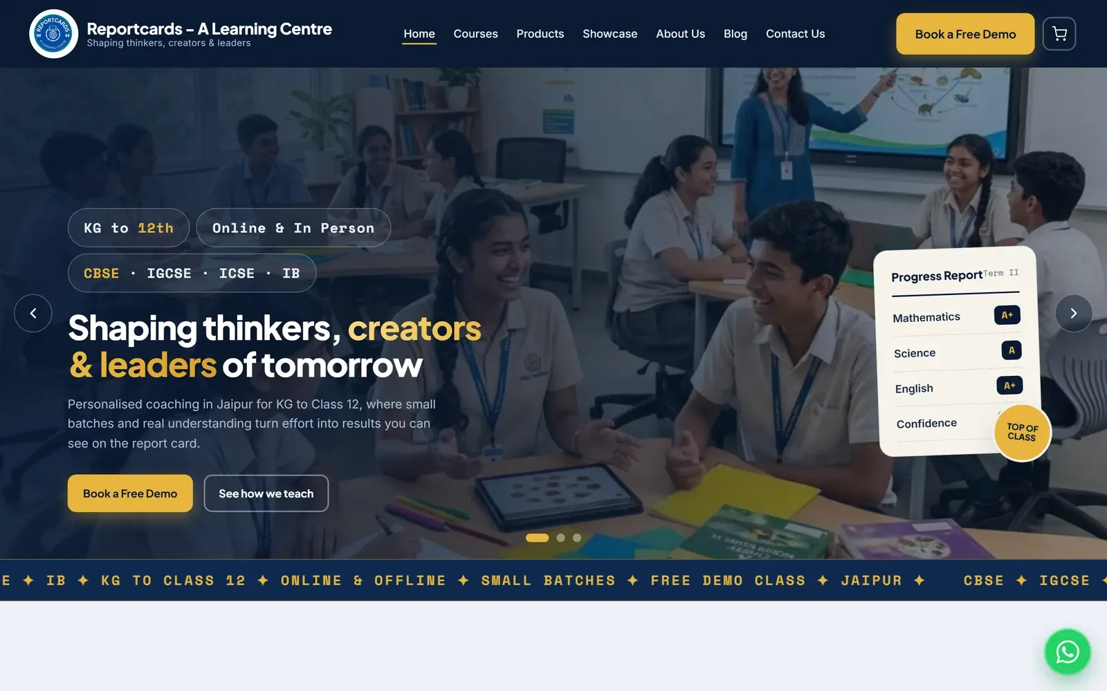
Website
reportcards.in: courses, guides for parents, practice tests and student accounts. Built so a Jaipur family can try something before they ever walk in.
SEE THE WEBSITE →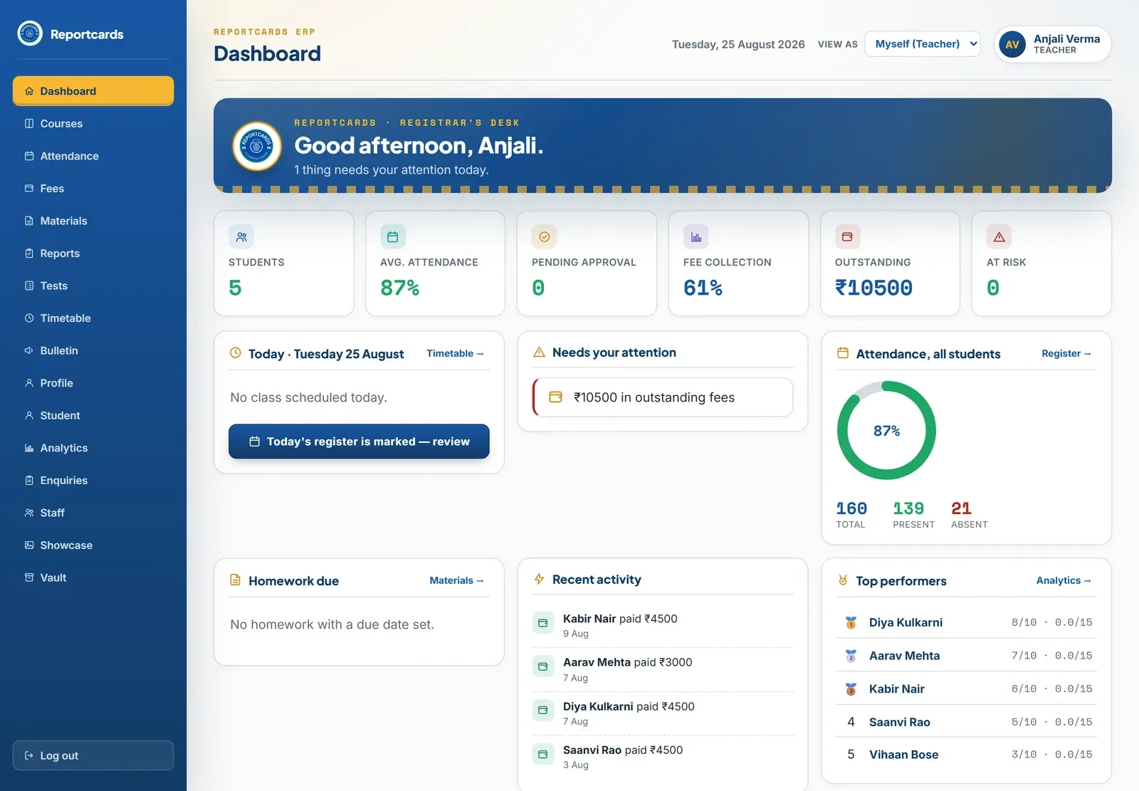
ERP
The app the centre runs on: attendance, fees, materials, exams and printable report cards. What you see depends on who you are.
SEE THE ERP →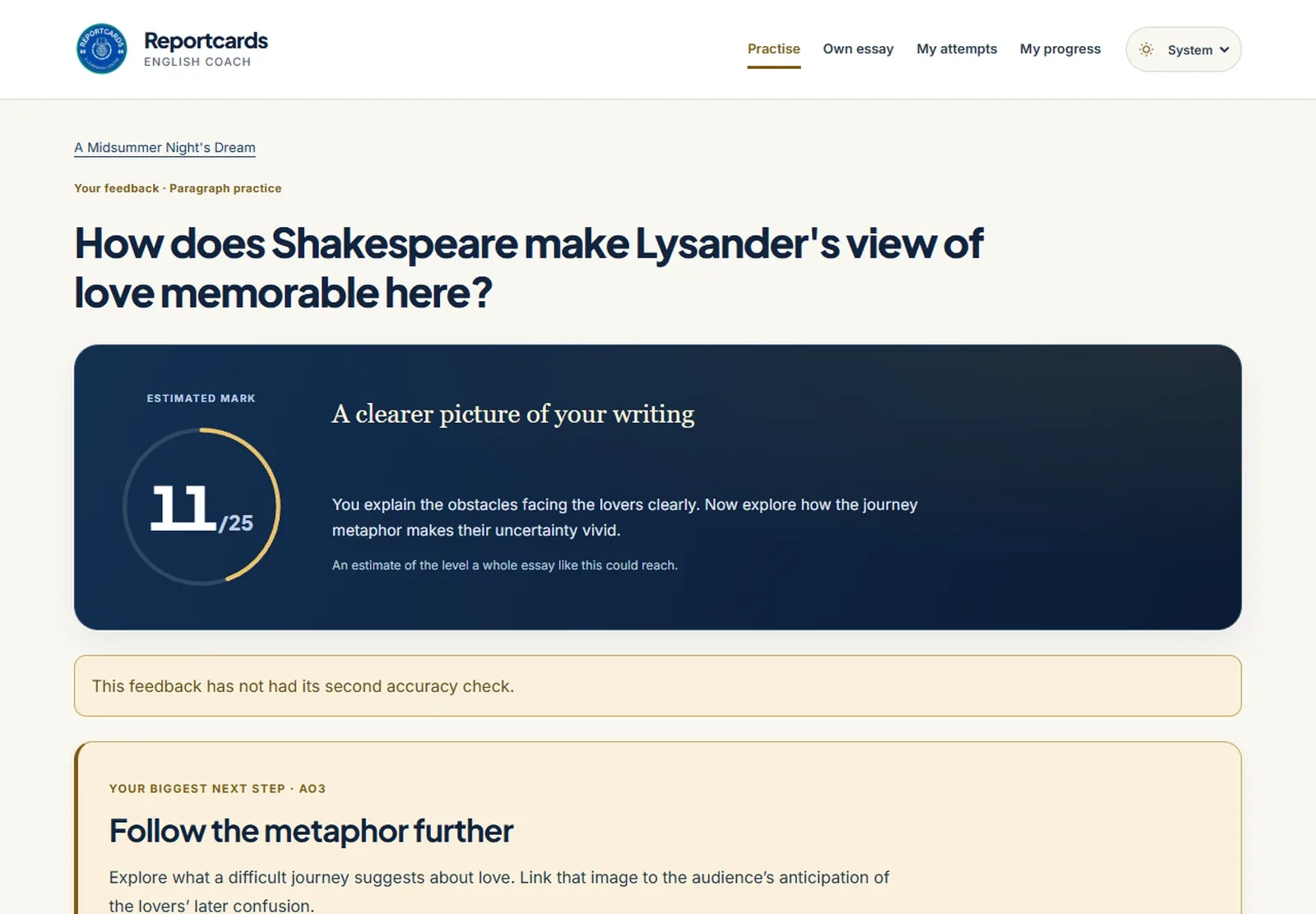
English
English Coach marks a student's answer against the real exam criteria. Odyssey turns reading into a journey. Paper builders make matched exam papers from code.
SEE THE ENGLISH TOOLS →Every reason on these pages comes from the brand kit, the build notes or the code itself.
At a glance
The problem
A Jaipur coaching centre ran on notebooks and WhatsApp, and its website gave families nothing to try.
What I built
A website families can try, the ERP the centre runs on, and English tools for students.
What changed
Site health 69 to 88 across the SEO work, 31 parent guides, 23 quiz pages, and accounts and paper grading live.
Read the transcript
This is the story of everything I built for Reportcards.
Reportcards is a coaching centre in Jaipur. It ran on notebooks and WhatsApp, and its website gave families nothing to try.
So I built each piece for the person who uses it: the families, the centre, and the students.
Part one, for families. A website they can actually try.
Built from the centre's own seal, with a report card where clip-art would usually be.
Practice tests run in the browser, free, with no sign-up.
Part two, for the centre. The E.R.P. it runs on.
One app, where your role decides what you see. The day starts with what needs attention.
A simple fee ledger, and report cards that print from the browser. Nothing to pay for.
Part three, for students. English Coach, and Odyssey.
An answer, marked against the official criteria, with one clear next step.
And reading as a journey, ten islands at a time.
The hard part was trust. These are children's records, so the database itself protects them, not just the screens.
And on the website, site health went from sixty nine to eighty eight.
The brand system
Built from the seal on the door
The centre already had a seal in blue, green and yellow. Instead of inventing a look, everything I built takes its colours from that seal, in fixed proportions, so the website, the ERP and the English tools feel like one place.
Decisions, and why
The report card is the logo's best friend
The recurring graphic is a small report card with grade chips and a round gold Top of Class stamp, used on the home page, the quizzes and the SAT page.
Why: The business is named after report cards. The kit says to reuse this card instead of mortarboards, apples and globes, which every tuition site already uses.
One cheap tool per job
The website is static pages with a small PHP backend for accounts. The ERP and Odyssey are static pages talking straight to Supabase. Tests run in the browser.
Why: Each piece uses the cheapest thing that does the job properly, so nothing needs a paid service or a server of my own.
Five colours, each with one job
The brand kit sets a rough balance: about 55 percent light neutrals, 25 blue, 12 green and 8 yellow. Calm and academic first; yellow is too loud to be anything but a signal.
Carries the layout. Most of every screen is this, so the content does the talking.
Headers and hero panels. The colour that says this is Reportcards.
Progress, correct answers and present-today. Only ever good news.
Calls to action and the seal's details. Never a big background.
Headings and text on light paper, dark enough to read at any size.
Two faces, plus a ledger hand
The kit pairs Plus Jakarta Sans for headlines with Inter for reading. Marks, grades and labels are set in a monospace, the way figures sit in a printed mark sheet.
Headlines and buttons. Friendly and modern without looking like a toy.
Body text and the interface. Built for screens, readable at small sizes.
Grade chips, labels and marks: the numbers a parent is looking for.
Specimens are set in the nearest font on your device; the real site loads its own.
The problem
Reportcards is a coaching institute in Jaipur, and it ran on notebooks and WhatsApp. Attendance, fees, exam marks and the report cards the business is named after lived in places that could not be searched, shared with a parent or handed to a new teacher. The website talked about the centre but gave a parent or a student nothing to actually try.
What it does
This is not one build. It is the public website and every tool behind it, built piece by piece through 2026 and still being improved: student accounts, practice tests, paper grading, the ERP the centre runs on, a separate reading app and the builders that produce its exam papers. Each has a different job, so each has its own page: open a part above.
Deliberately unglamorous where it counts: fees are a manual ledger with no payment gateway, and report cards print through the browser. Neither needs a paid service.
Who it is for
A coaching institute's students, parents and teachers, and the families in Jaipur searching for tuition before they ever walk in.
Why it is built this way
Each piece uses the cheapest thing that does the job properly. The website is static HTML with a small PHP and SQLite backend for accounts. The ERP and Odyssey are static HTML talking straight to Supabase, with no build step and no server of my own, and the access rules live in the database rather than in the interface. The tests run in the browser, so taking one costs nothing to host. The ERP and Odyssey install as apps and are wrapped for Android.
What was hard
First, the access model, because the ERP holds children's attendance, fee and progress records. Records are protected by role-based policies in the database itself, so the screens are not the security boundary. Fees are the clearest case: only the admin manages the ledger and a parent sees the fee view for their own child, with the rules for who can read it set by database policy rather than by what the menu shows. Second, notifications that never arrived. The mail, push and PDF workers were built and then never scheduled, so queued notices sat undelivered with nothing on screen to say so; scheduling them as Windows tasks fixed that. A later check of actual delivery found push alerts still reaching nobody, because no one had turned push notifications on. So the workers now report a heartbeat and there is a list of undelivered alerts, and a silent failure shows up instead of hiding. Third, test questions that cannot mark a right answer wrong: in a literary devices test, sibilance is also alliteration, so a wrong option can still be true of the quoted line. The tests have validators for broken questions, and the literary devices test has one that checks for exactly those overlapping pairs.
Outcomes
- 31 parent guides
- 23 quiz pages
- Accounts and paper grading live
- My audit engine's score 76 to 93 (site health across the SEO work: 69 to 88)
Stack
Need something similar?
Tell me what your team does by hand today and what the finished system needs to do. I will tell you whether an automation, a custom tool, a portal or a website is the right shape.