MAKO
Website for a build and marketing studio
The website for MAKO, the build-and-marketing studio I co-ran: fixed prices, real campaign numbers, one-tap WhatsApp.
At a glance
The problem
Small businesses get "contact us for a quote" and agency claims they cannot check.
What I built
The studio's website: prices on the page, real dashboard receipts, and every button straight to WhatsApp.
What changed
A five-page site live on the studio's domain. Separately, as COO I grew the studio's revenue 333% in five months.
Walk through it
Read the transcript
This is MAKO, the build and marketing studio I co-ran, and its website.
Small businesses keep hearing, contact us for a quote. And agency claims they cannot check.
So the site puts prices on the page, shows real receipts, and is one tap away from the people doing the work.
A mako is a shark. So the mark is a fin, and one cyan carries every highlight.
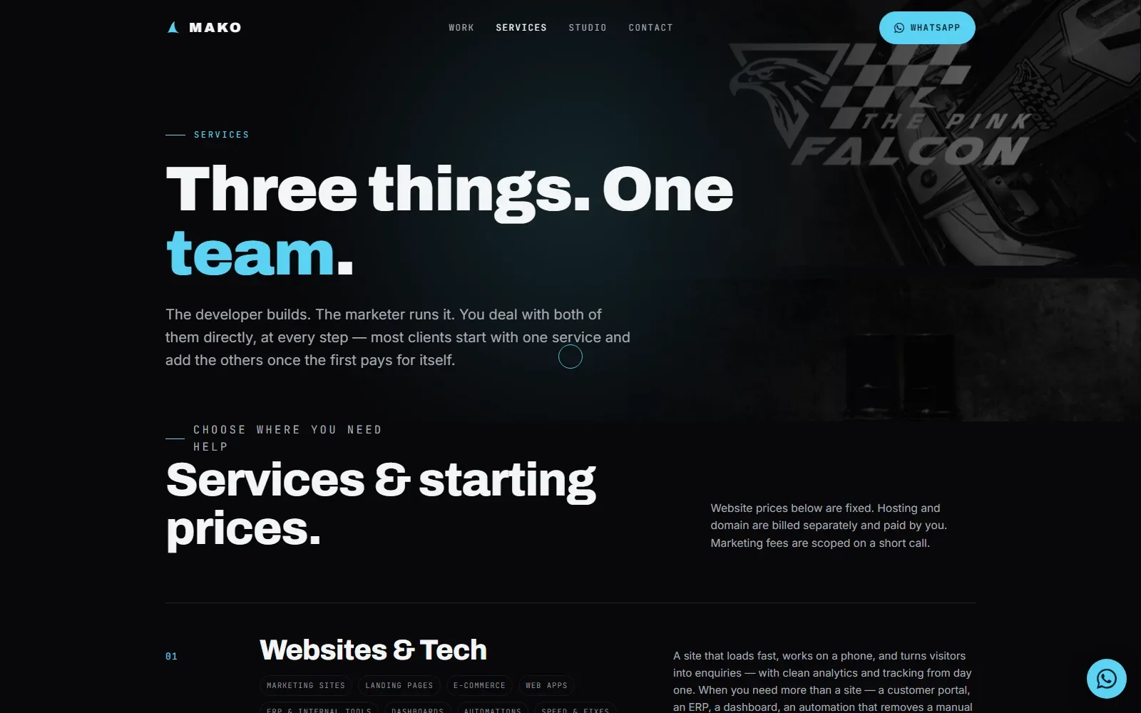
Fixed prices, printed on the page, so a business can judge fit before it messages.
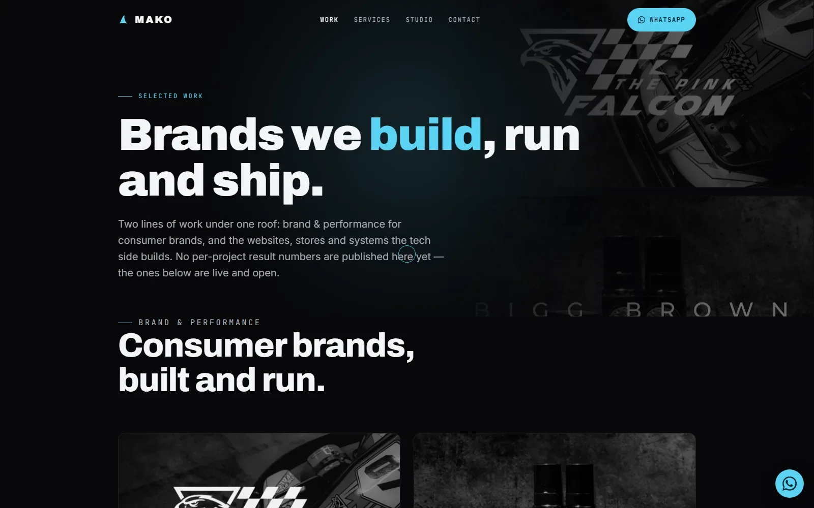
Case studies show cropped, real dashboards, not agency claims.
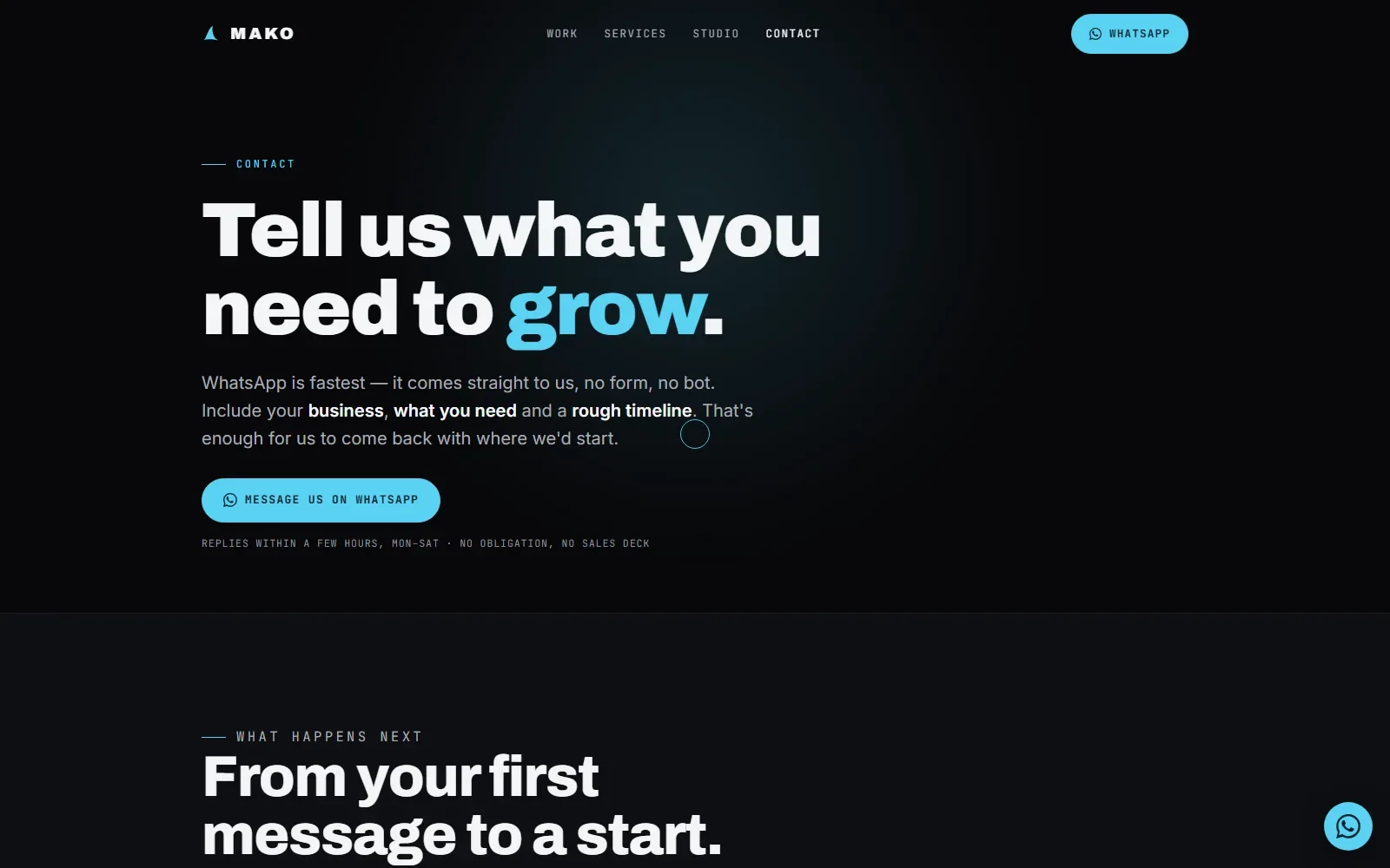
Every button opens WhatsApp, straight to the two people who do the work.
And while I was C.O.O., revenue grew by three hundred and thirty three percent in five months.
Why it looks and works this way
A shark, one colour, and proof
MAKO was a two-person studio: a developer and a marketer. The site had to say that in one screen, show real receipts instead of agency claims, and get a small business talking to us on WhatsApp.
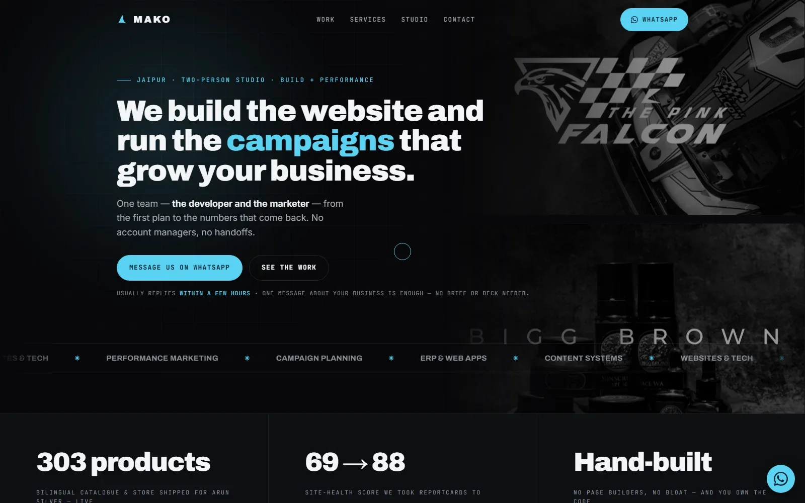
Read the home page
The MAKO home page.
- A mako is a shark
The logo changed from a starburst to a dorsal fin in cyan. The name, the mark and the colour now say the same thing.
- One accent, one meaning
Cyan is the only accent: the highlighted word, the buttons and the labels all point at the same idea.
- Every button opens WhatsApp
No form and no bot. The first message goes to the two people who do the work, because no handoffs was the pitch.
- Real work behind the headline
Client screenshots scroll slowly behind the hero, grey and faded, so the work is there from the first second without fighting the words.
- Build proof, not just ads
The proof strip shows website and development results, because the studio sold both halves.
Decisions, and why
Near-black and shark cyan
A near-black site with a single cyan accent and a deep teal for text on cyan.
Why: The shark idea carried by one colour keeps every highlight pointing at the same thing.
A heavy grotesk and a mono
Archivo at 800 to 900 for headlines, Inter for reading, JetBrains Mono for every label and button.
Why: My reading: the mono labels speak for the developer, the heavy headlines for the marketer, and Inter keeps paragraphs easy to read.
Prices on the page
Fixed website prices in three tiers, SEO in its own three tiers, marketing scoped on a call.
Why: A price on the page replaces a contact-us-for-a-quote wall, so a small business can judge fit before messaging.
Receipts, not claims
Case-study numbers come from a client's real Instagram and Meta Ads exports, shown as cropped dashboards. One invented budget figure was softened.
Why: Attributable receipts are more credible than agency claims. Evidence over noise was a studio principle.
Five pages, one file each
Home, work, services, studio and contact share one stylesheet and one script, with no framework and no build step.
Why: It matched the zero-marginal-cost approach the studio sold to its own clients.
Launched behind a password
The site was built on a password-protected copy and only promoted after checking, with HTTPS, redirects, headers and a real 404 set first.
Why: A client-facing site should never show a half-finished page. Motion is also optional for anyone who turns it off.
Night water and one fin
Every page's ground.
Bands such as the proof strip.
The only accent: highlights, buttons, labels.
Text sitting on cyan, so buttons stay readable.
Headings and main text.
Secondary text and navigation.
Type
Headlines, the wordmark and big proof numbers.
Body copy.
Navigation, buttons, eyebrows and labels.
Specimens are set in the nearest font on your device; the real site loads its own.
The problem
MAKO is the two-person studio I co-ran with Manhit Kohli - he ran marketing and campaigns, I built the websites and systems - and until this build it had no site of its own. The work was real (Reportcards' site health climbing 69 to 88, Arun Silver's 439-product bilingual catalogue, a client's Instagram reels pulling millions of views) but none of it lived anywhere a prospect could see it, and the domain itself just showed a placeholder "coming soon" page.
What it does
The public site for MAKO, the two-person build-and-performance studio I co-ran with Manhit Kohli. Five plain pages - home, work, services, studio, contact - sharing one CSS/JS bundle, deployed to Hostinger with no framework and no build step, matching the zero-marginal-cost approach the studio sells to clients.
Fixed website pricing on the page, marketing scoped on a call, and a case-study section built from a client's real Instagram and Meta Ads exports rather than agency-speak. Every CTA is one WhatsApp link, prefilled, no form and no bot in the loop.
Who it is for
Businesses looking for one team that builds the website and runs the marketing.
What it does, feature by feature
- Five pages, one bundle. Home, work, services, studio and contact share one set of styles and scripts, hand-built with no framework.
- Prices on the page. Website packages carry fixed prices instead of a quote form. Marketing is scoped on a call.
- Real receipts. Case studies built from a client's actual Instagram and Meta Ads exports, not agency claims.
- WhatsApp-first contact. Every call to action opens WhatsApp with a starter message already typed.
- Safe launch. Built and checked on a password-protected preview copy before it replaced the live domain.
- Production basics. Forced HTTPS, redirects, security headers, caching, a real 404 page, and privacy and terms pages written for the studio's actual setup.
Why it is built this way
Built as a plain multi-page static site - one shared CSS/JS bundle across home, work, services, studio and contact, no framework, matching the studio's own zero-marginal-cost philosophy. Services carry fixed prices printed on the page instead of "get a quote," and every call-to-action is a WhatsApp deep link prefilled with a "My business:" starter message, because the studio's whole pitch is no account managers and no handoffs. Deployed to a password-protected staging copy first, checked there, then promoted to the live root once it held up - so the real client-facing domain never showed a half-finished page.
What was hard
The studio's own case-study numbers did not exist as a clean dataset; they were scattered across a client's Instagram and Meta Ads exports in one portfolio zip. Mining that turned an "agency claims" page into one with attributable receipts: six reels for one client totalling roughly 12M views and 8.6M accounts reached, and four August-2026 Meta ad campaigns spending about ₹36.5k for 297 leads - one of them landing 53% under the Jaipur benchmark cost-per-lead. And going from a placeholder straight to a live public domain meant the boring infrastructure had to be right the first time: forced HTTPS and www redirects, a real 404 page, and Privacy/Terms pages rewritten for the studio's actual stack (no analytics, no form, Google Fonts disclosed) instead of template boilerplate.
Outcomes
- ~12M reel views cited
- 297 leads, ~₹36.5k spend
- Fixed prices, no quote form
Stack
Need something similar?
Tell me what your team does by hand today and what the finished system needs to do. I will tell you whether an automation, a custom tool, a portal or a website is the right shape.