Seeking Self
A website for Seeking Self
Seeking Self is a small education brand in Jaipur. I built their website.
At a glance
The problem
Parents knew the printed brochure, but nothing online felt like it, and enquiries got lost in chats.
What I built
A website matched to the brochure, a three-tap programme finder, and enquiries saved to the owner's sheet before WhatsApp.
What changed
A 58-page site where every enquiry is recorded, and an Instagram plan of 60 reels across three pages.
Read the transcript
This is Seeking Self, a small education brand in Jaipur, and the website I built for them.
Parents knew the printed brochure. Online, nothing felt like it, and enquiries got lost in chats.
So I brought the brochure to life online, with a straight path from a parent's question to a call back.
The colours and the tall headlines come straight from the brochure.
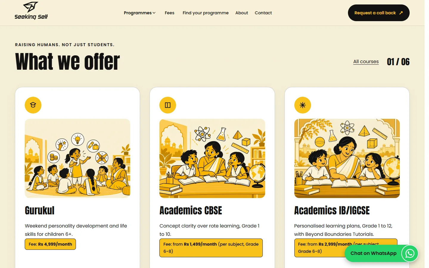
Fees are shown openly. A small brand earns trust by not hiding anything.
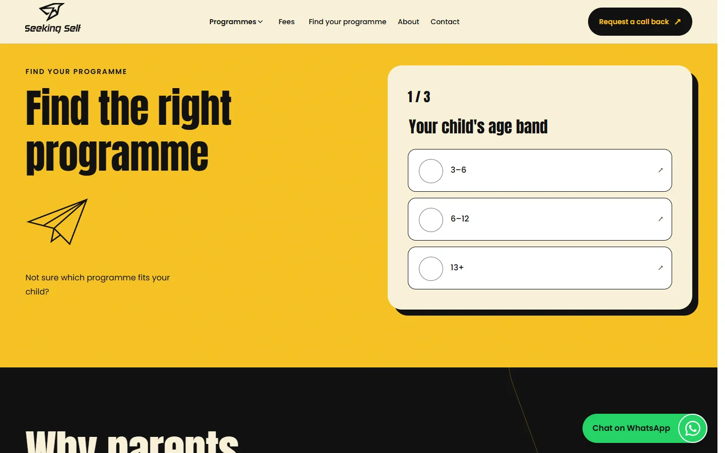
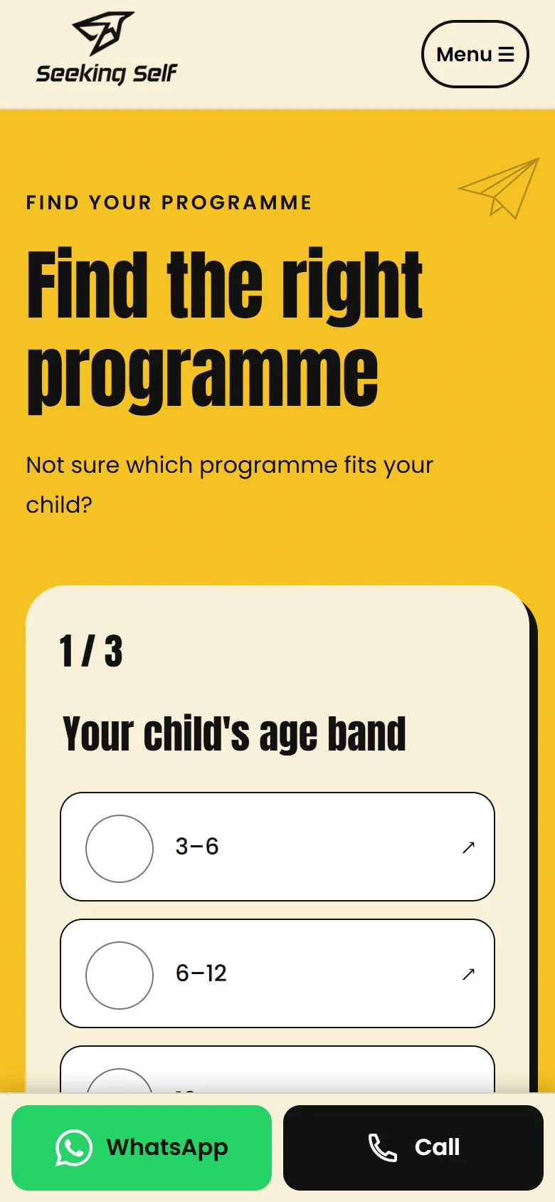
Three taps find the right programme, then open a call-back form already filled in.
Every enquiry is now saved to the owner's sheet first, then offered on WhatsApp. None get lost.
And for Instagram, I planned sixty reels across three pages, with a seven day Confident Speaker Challenge.
Why it looks and works this way
The brochure, brought to life
Seeking Self already had a printed brochure that parents knew. The website's brief was simple: match it. Every choice below starts from that brochure, then asks what a parent on a phone needs next.
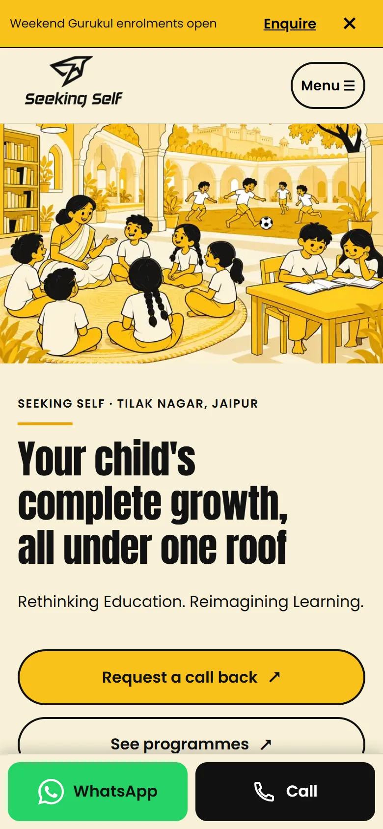
Read the home page
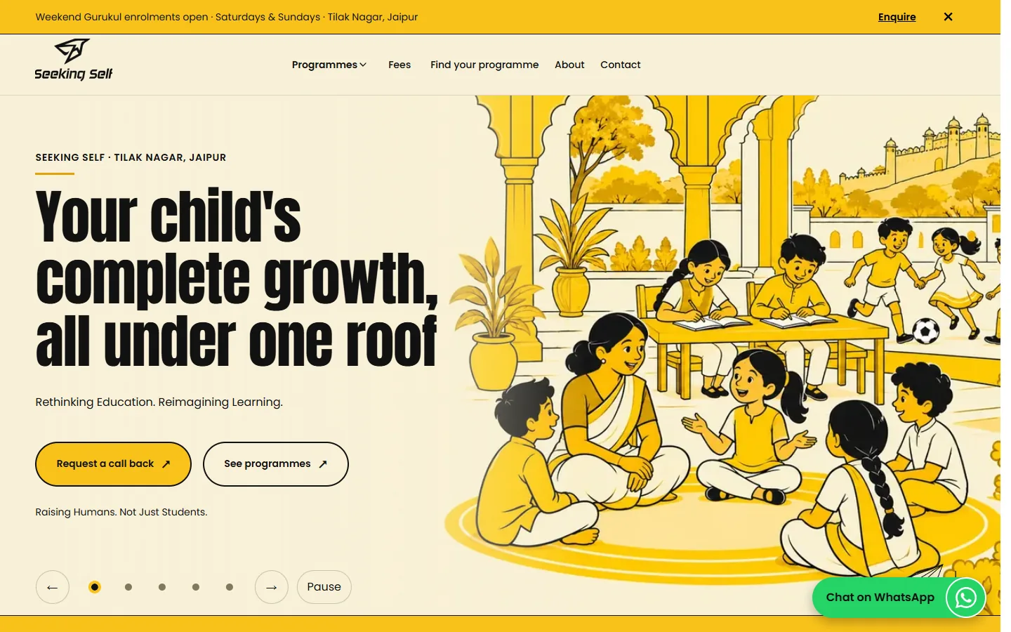
The home page on desktop.
- The lead programme on every page
A slim bar announces Weekend Gurukul enrolments and opens the call-back form. Close it once and it stays closed.
- A condensed face, like the brochure
Anton, tall and heavy, was chosen to echo the printed brochure, with Poppins for everything else.
- Live text on calm art
The banner art keeps its left 45 percent quiet, so the headline and buttons stay real text: readable, searchable and translatable.
- WhatsApp green, black label
White on WhatsApp green measured 1.98 to 1. Black text on the same green keeps the button recognisable and readable.
Decisions, and why
Yellow as an accent, not a wall
Most full-width yellow sections became cream or white. Yellow now lives in chips, underlines, steps and buttons, with at most one yellow band and one black band per page.
Why: The owner wanted it to look good, not loud. Rationing the yellow keeps it strong where it is used.
Three taps to the right programme
A short quiz (age band, what matters most, board) recommends one or two of the six programmes, then opens the call-back form already filled in.
Why: Parents unsure which programme fits get a direct path to a call. Without JavaScript it is a plain list of links.
No enquiry is ever lost
Every form saves the details to a private Google Sheet first, then offers WhatsApp pre-filled with what the parent typed. If saving fails, WhatsApp is the fallback.
Why: Leads used to vanish in chats. Now there is a record, and parents still get the channel they use.
No pop-up ambush on phones
Desktop gets a call-back prompt after 30 seconds or on exit, at most once a week. Phones only get a small card after scrolling 60 percent.
Why: A full-screen pop-up interrupts a parent reading on a phone, and Google penalises it.
Only what the brochure says
Facts come from the brochure and approved numbers only. Fees are shown openly; where a fact is missing the page says to message for details.
Why: A small brand earns trust by not inventing anything, and visible fees convert.
A plan for Instagram too
60 reels across three pages, with a 7-day Confident Speaker Challenge.
Why: The website catches parents who search; the reels reach parents who scroll.
A parent's path
The banner and the Weekend Gurukul bar say what is on offer.
Three taps in the programme finder narrow six programmes to one or two.
The call-back form opens pre-filled and saves to the owner's sheet.
WhatsApp opens with the parent's own words already typed.
The brochure's colours
The palette is the printed brochure's, exactly, so a parent who has held the brochure recognises the site at once.
Buttons, chips and the programme finder band. The brand's signal.
Hover states, focus outlines and the offset shadows on tables.
All text, and one dark band per page for contrast.
Page and header grounds. Warmer than white, like paper.
Only on WhatsApp buttons, so parents spot them instantly.
Two faces
Headings, numbers and fees. Tall and condensed, like the brochure.
Body text, navigation, buttons and forms. Round and friendly.
Specimens are set in the nearest font on your device; the real site loads its own.
What was built
I built the website and also planned their Instagram: 60 reels across three pages, with a 7-day Confident Speaker Challenge.
What the website does
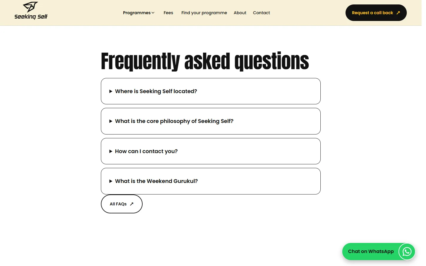
The site is built around Seeking Self’s programmes: a card for each programme, a programme finder, and answers to frequently asked questions, laid out for phones as well as desktops. The screenshots below walk through each part.
More websites I have built: Arun Silver, MAKO and Reportcards. How I work on websites: website development.
Walk through it